Background
The goal outlined in the project brief was to combine two contrasting brand identities into a cohesive packaging design. I was intrigued by the irony of selecting two products of the same genre but that served very different purposes. I settled on Sleepytime Tea and Redbull because of their iconic branding.
Design Process
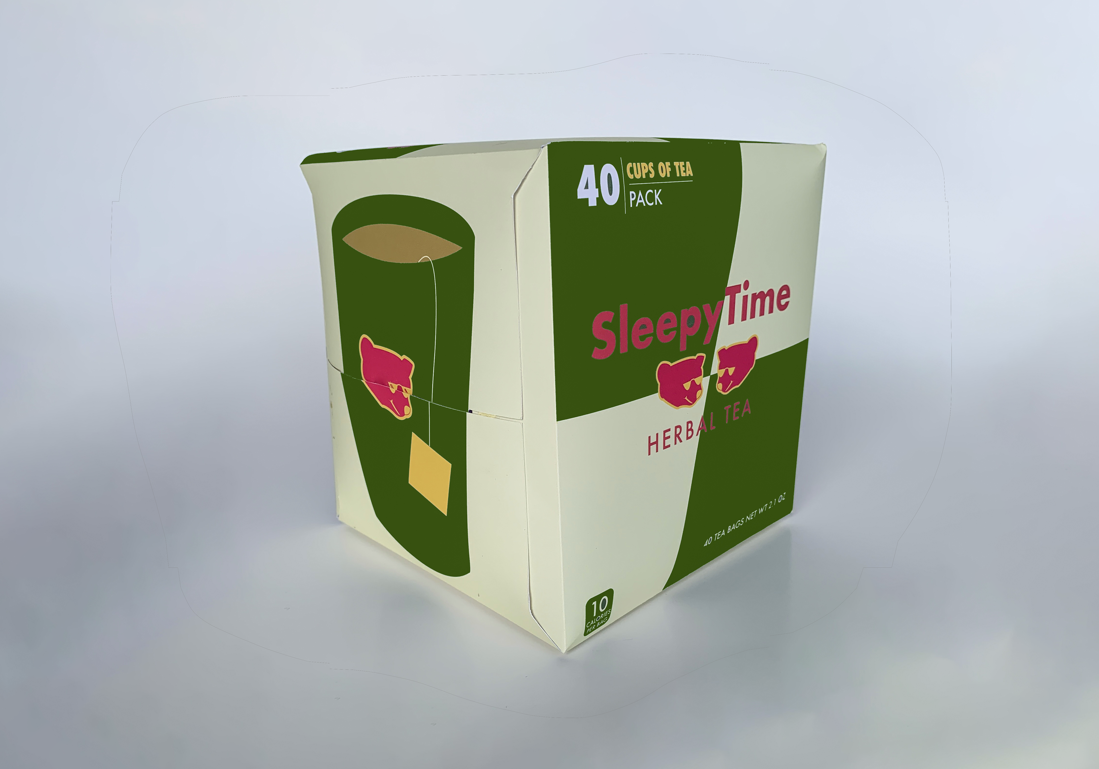
I knew immediately that I wanted the focal point to be the Sleepytime bear, the hero of the packaging and the brand as a whole. I stylized the bear in the vibrant, flat style of the Red Bull logo and gave him sunglasses to maximize his cool factor. I also pulled patterns and fonts from the original Red Bull packaging, while bringing in content from the Sleepytime Tea box.
To construct the packaging, I disassembled and measured an existing Red Bull box. I sketched and digitized it, then added flaps, fold lines, and cut lines.
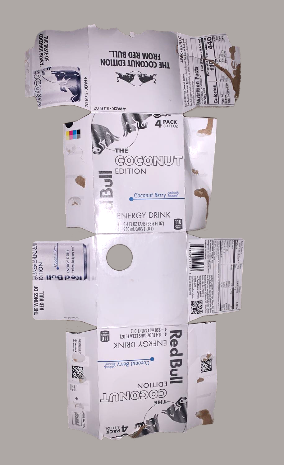
Reference packaging
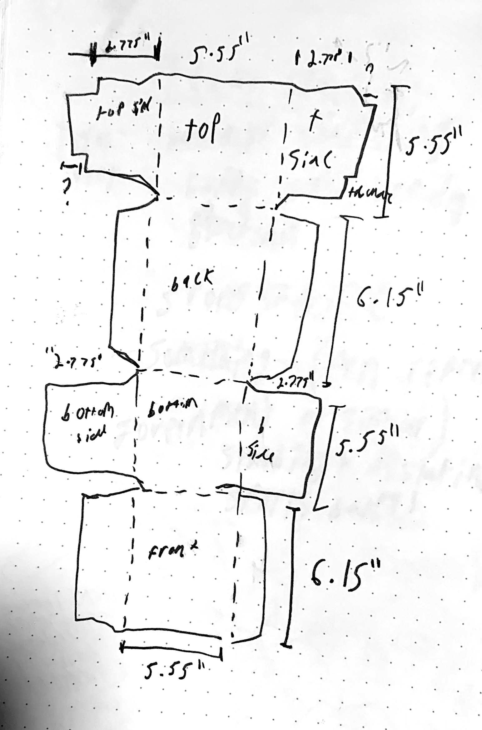
Sketch
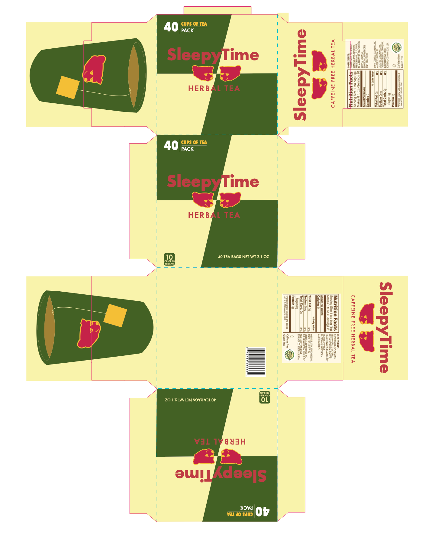
Flat packaging
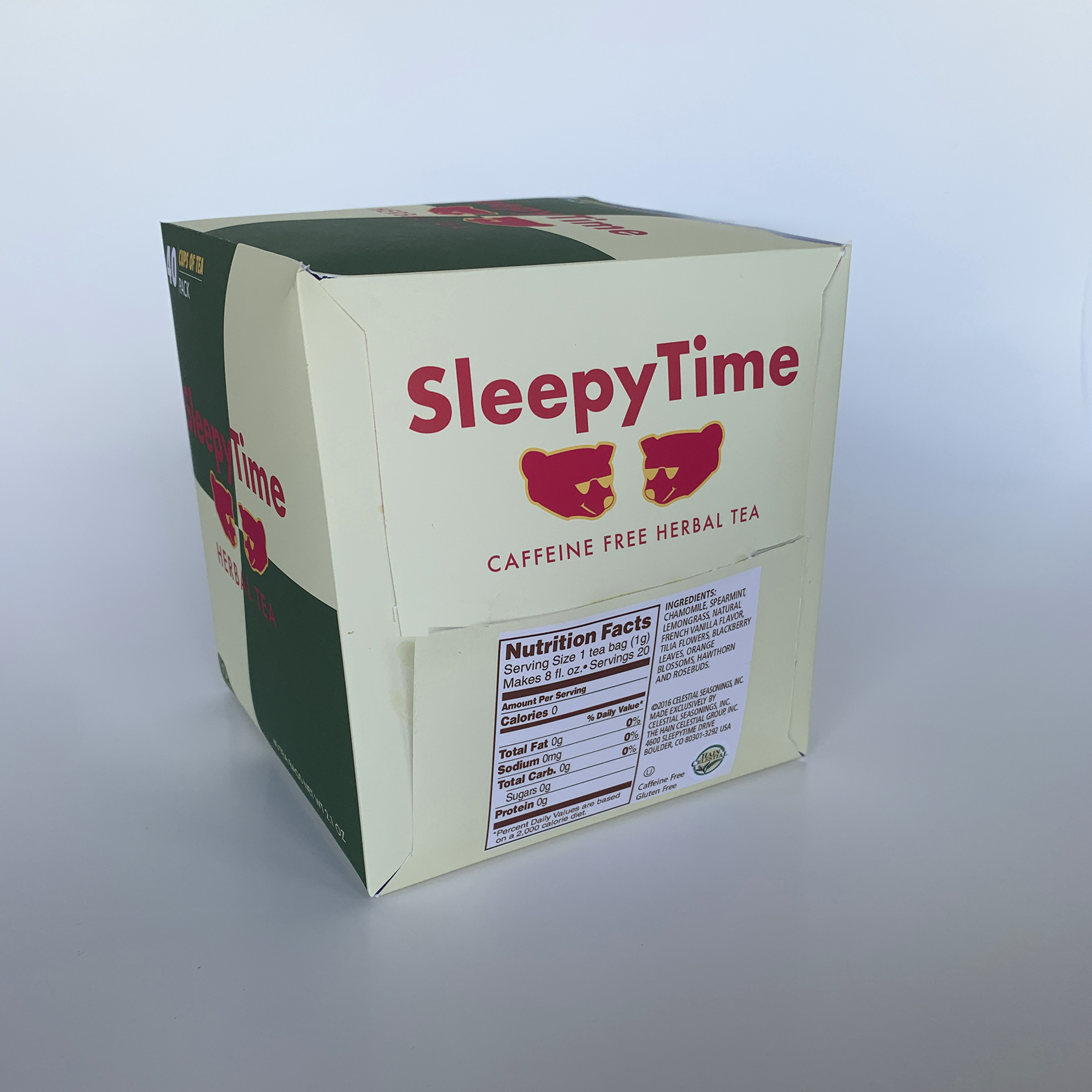
Assembled prototype