Case Study Contents
1. Background
2. Research Methods
• Identifying Key Problems
• Competitive Analysis
3. UX Methods
• Card Sorts
4. Design Process
• Atomic Sketches/
Proof of Concept
Proof of Concept
• Style Tile
• Hi-Fi Draft
5. Before & After
Background
Student Affairs is the office at Eastern Washington University that addresses and advocates for student needs. Through purposeful programs, activities, and services, Student Affairs departments lead the campus in delivering personalized support to students, fostering their holistic development.
In 2023, I was asked by the Dean of Students to restructure and redesign the Student Affairs website.
Research
Key Problems/Pain Points
I did a deep dive into the site to determine what wasn't working and how it could be improved. I found three major issues throughout:
• Lack of visual hierarchy and scannability
• Inconsistent, illogical navigational/organizational structure
• Visually unappealing and outdated
Competitive Analysis
We completed a competitive analysis of similar sites at other universities.
Takeaways:
• We have three major audiences with diverse needs: students, faculty, and parents/guardians. Grouping content by audience helps users self-select a menu of content that is targeted at them.
• Student Affairs is an umbrella that covers a LOT of departments, resources, and information. Hierarchy in the form of buttons, cards, and dropdowns helps make pages more palatable and scannable.
• Considering the complexity of content, first-person phrases such as "I need financial assistance" help audiences think less and get where they need to go faster.
Internal Site Audit
I also did a visual audit of other internal and external sites within EWU to gather ideas and pull together a cohesive visual identity.
User Experience Design Methods
Card Sort
I decided to tackle the navigation redesign atomically, creating a card for every page on the website and sorting them logically into menu categories. I named the categories, keeping our audiences and their goals in mind.
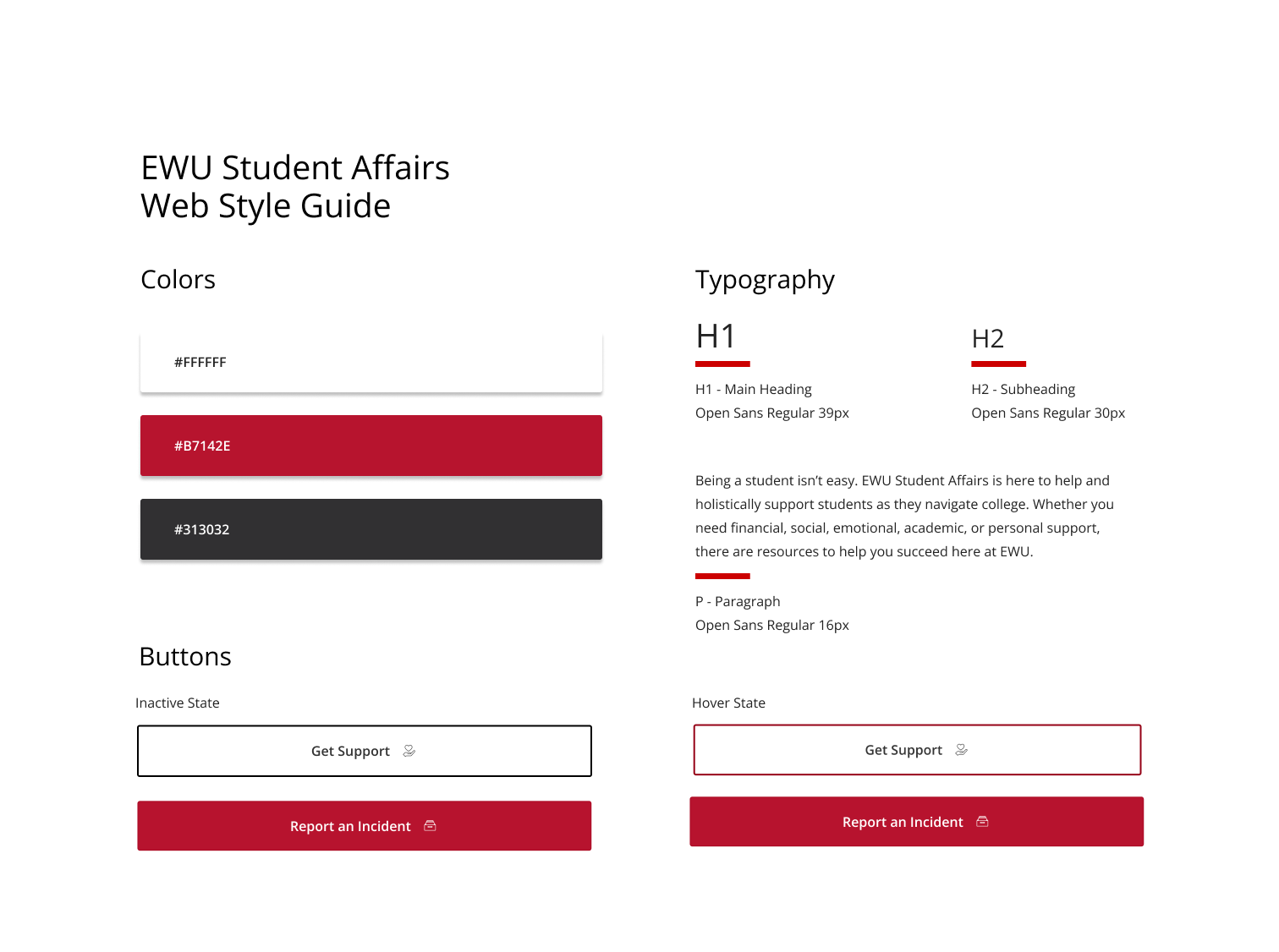
Style Tile
Atomic Sketches/Proof of Concept
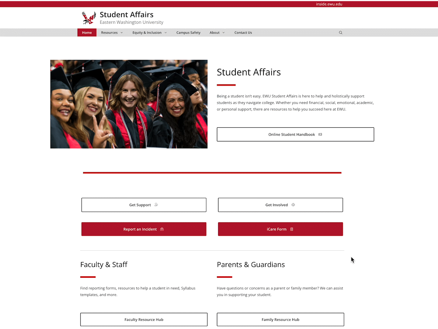
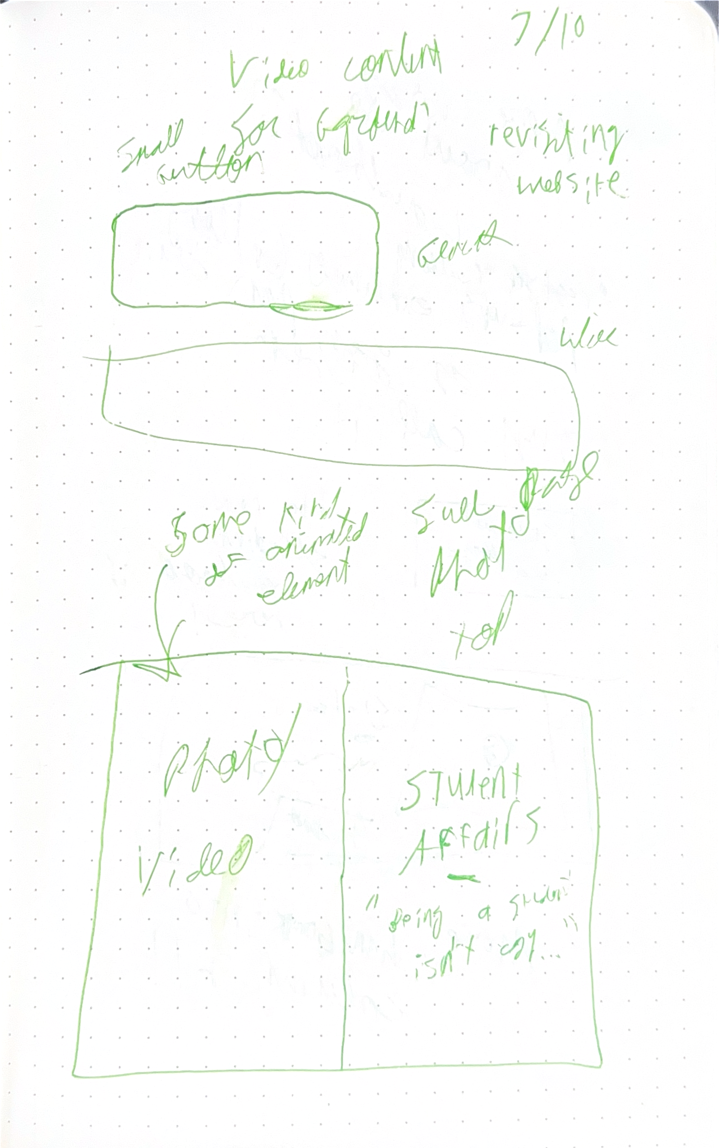
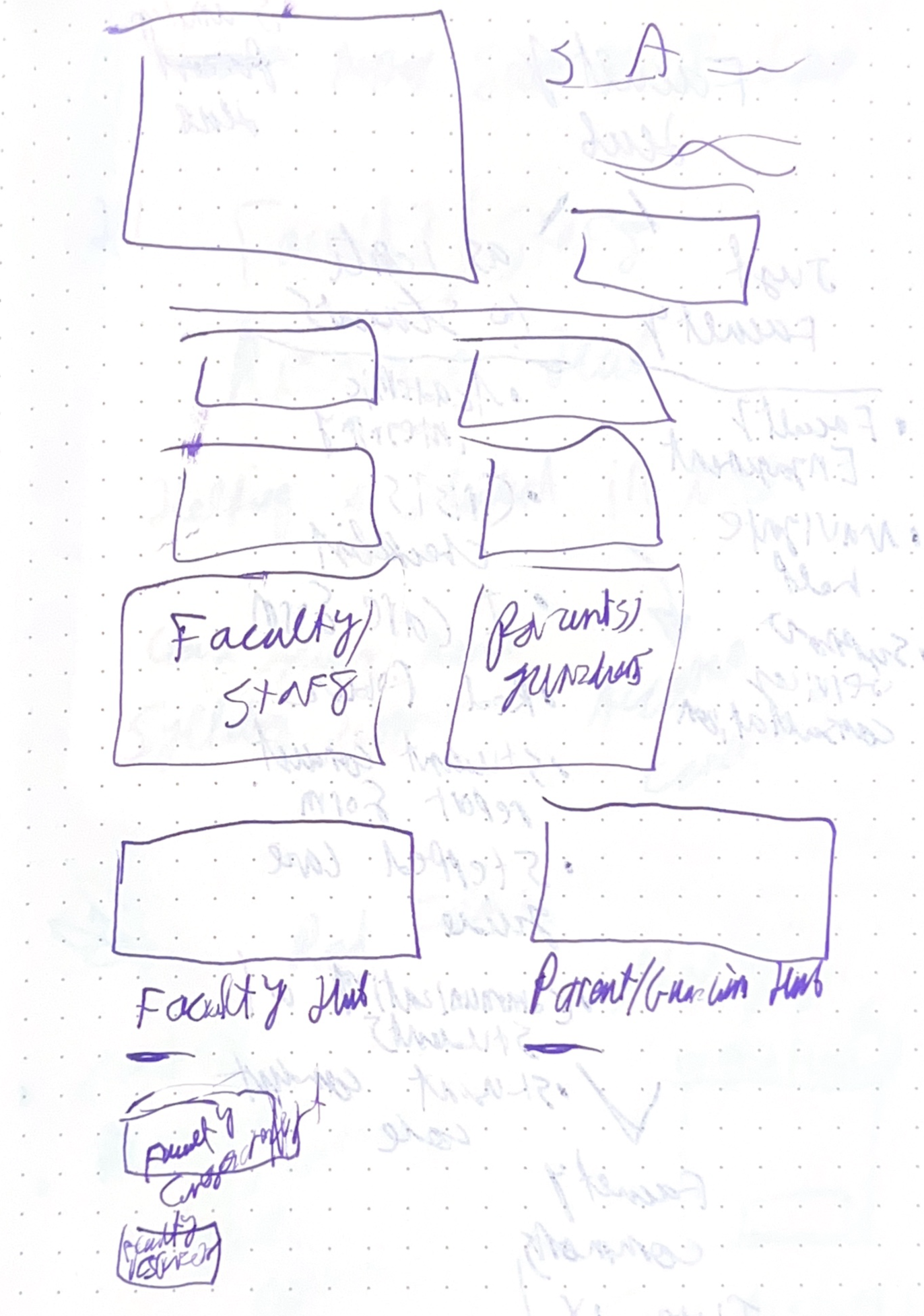
Starting with some loose frameworks and evolving into more defined wireframes, I sketched out what our elements might look like and how different levels of content would nest.
Home Page element sketches
Home Page layout sketch
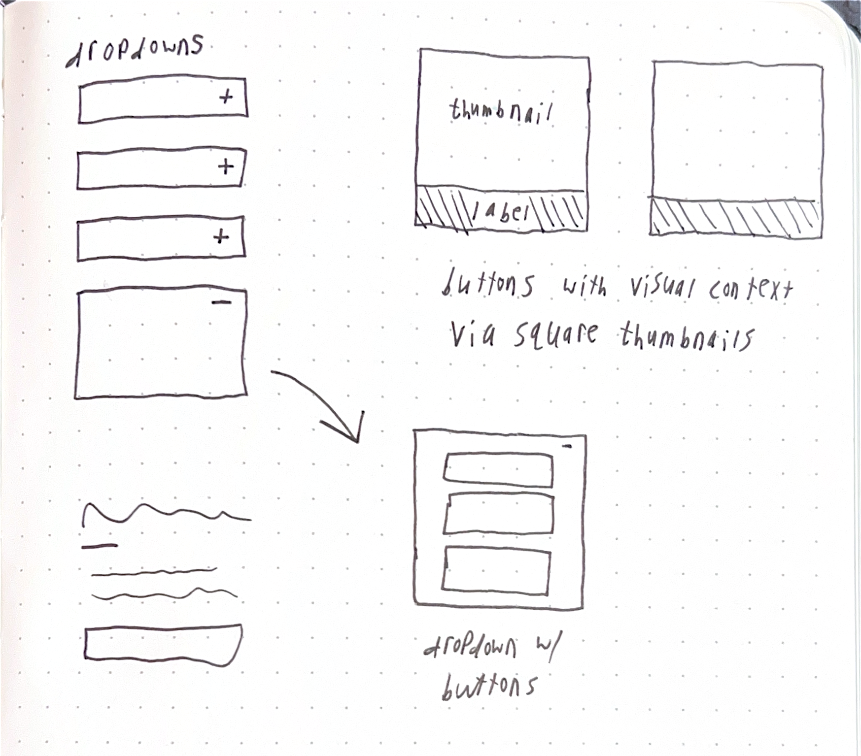
Dropdown & button library sketches
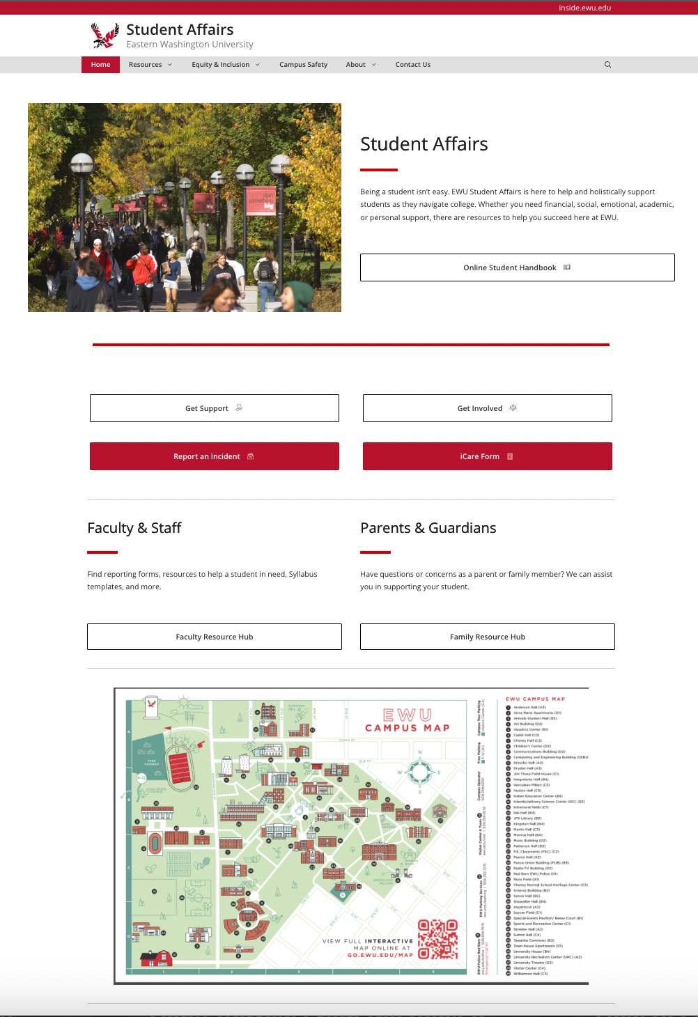
Online Student Handbook
One of the major content adds was the Online Student Handbook, which was requested by the University President. Nothing like it existed at EWU, and administrators and staff were invested in the idea of a single link that would take students to a guide catered to answering their questions. I worked with Student Affairs leadership to compile content relating to their respective departments.
Considering the large amount of content, much of it being aggregated links, I decided to organize the handbook as a series of dropdowns containing buttons. The dropdowns made it so that users could quickly scan the "chapters" of the handbook without needing to scroll much.
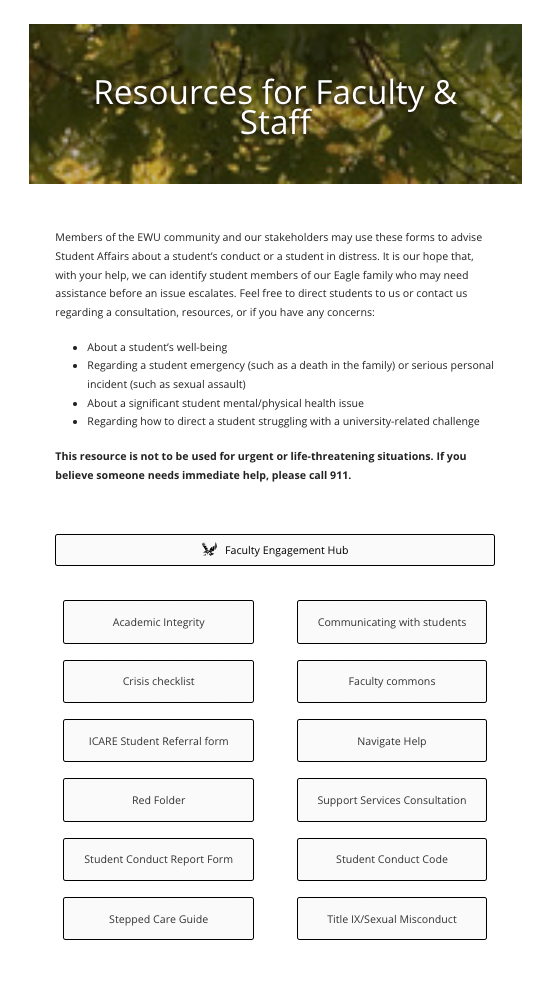
Faculty Resource Hub
The Dean of Students requested the addition of a Faculty Resource Hub, consolidating the content of multiple pages into one. The need for a hub arose when my design team colleagues launched the Red Folder project in 2022, containing guides for faculty to help students who are struggling. There was some overlap between the Red Folder content and the old faculty resources page, creating friction and confusion for faculty who then had to guess where to look. I used the same card sort method as with the site navigation to analyze and categorize all faculty-related resources.
Hi-Fi Draft
We internally released a draft and met with leaders throughout the university for feedback. After some tweaks, we were ready for launch!
Before & After
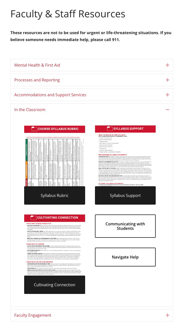
I included preview thumbnails with buttons that corresponded with PDFs for faster scanning and recognition. I also categorized the content into dropdowns.